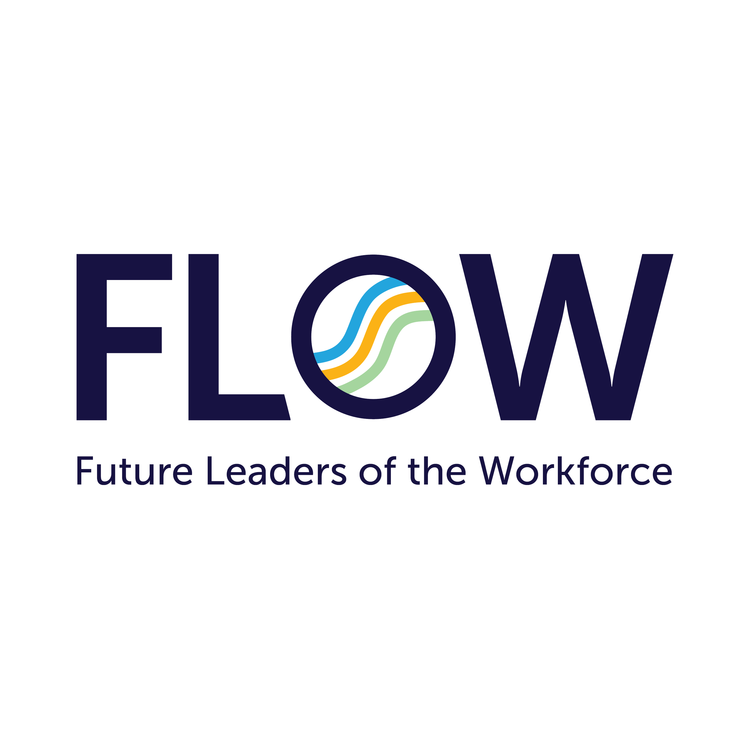
Designed the logo for FLOW, a sub-brand of the Memphis non-profit Oasis of Hope, focused on youth workforce development.
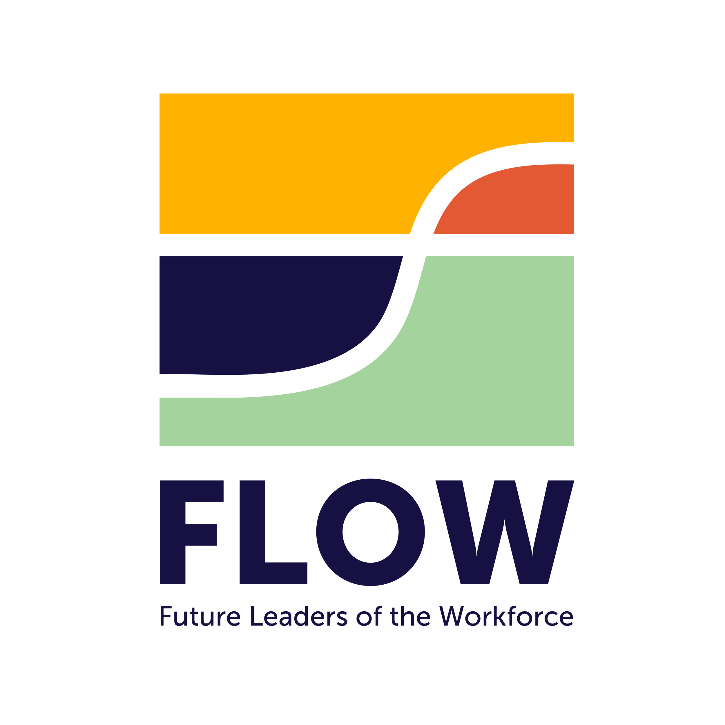
Given the varied projects for teens, the team wanted a simple logo emphasizing movement. The final design features three lines forming an 'F', symbolizing upward movement. The blue and green reflect Oasis of Hope's brand, while yellow represents FLOW’s energy and positivity.
Brand Identity, Logo
FLOW

Concepts


Final Word Mark & Icon
*parent brand I worked with to create the sub-brand